
I designed a simple, yet bold san serif logo with a floral illustration to give the brand a modern, organic feel.
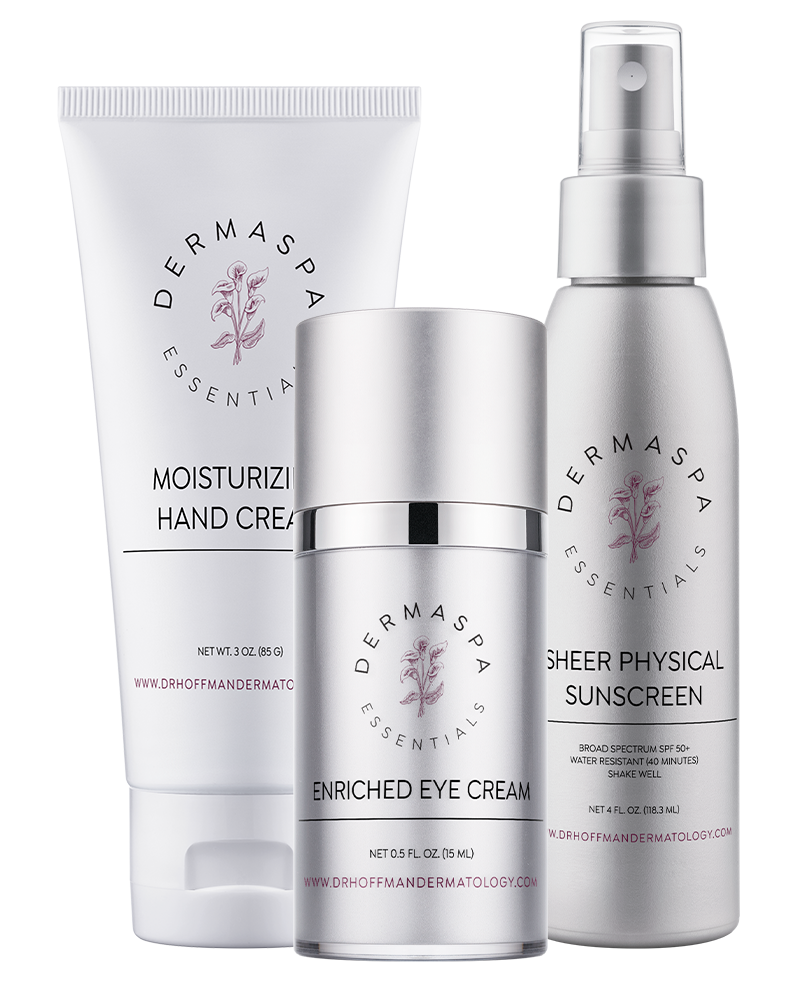
I created a second logo and label option for DermaSpa Essentials that still maintains a modern, organic or modern apothecary feel.

I designed a label that really focuses on the brand and highlights the logo. I added an paint-like stroke behind the geometric logo to create a balance between organic and structural.

With a logo that uses a more delicate serif and sketched line drawing, I added an organic floral background to accentuate the femininity and free form feel of the brand.

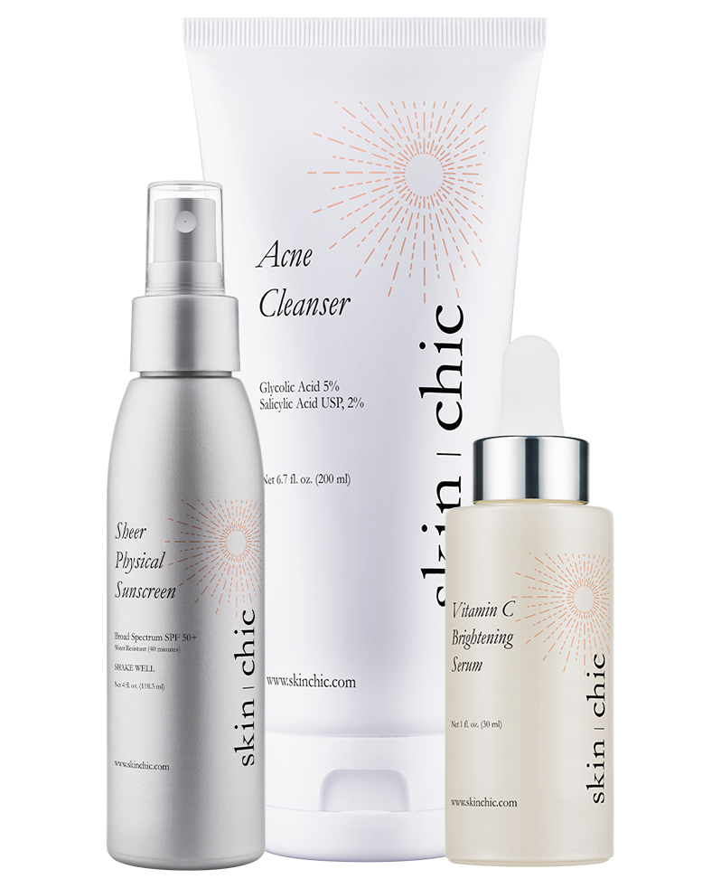
I used a san serif font and geometric element to balance the label with the serif logo. I also added a gradient for a pop of color to balance out the bottom with the logo-strong top of the logo.

I added an organic graphic element to maintain a consistent sense of branding with the script font in the logo.

I used a hand written font for the more personalized product names to match the free form feel of the logo.
With a clean serif logo to work with, I designed an elegant label that utilizes the logo’s serif font. I also added a delicate, soft-colored graphic that accentuates and maintains the brand’s classy feel.

I used relaxing imagery and a serif font to design a branded label appropriate for a spa.